

Most personal finance dashboards share a common flaw: they are built to show everything, which means they effectively show nothing. Forty metrics, three chart types, a pie chart that updates live, and a colour-coded spending wheel that takes twenty seconds to parse before you give up and close the app.
A dashboard that actually makes sense is not the one with the most data. It is the one that answers the specific questions you actually have about your own financial life, in the clearest possible way, without requiring you to dig, scroll, or interpret.
This guide walks through how to build one — whether you are starting from a tool that already exists, building your own, or choosing a platform that does the work automatically. The principles are the same regardless of approach: decide what matters, eliminate what does not, and make the remaining numbers easy to read and act on.
Read more: Talk to Your Money: WealthNX Launches Voice AI for All Your Financials
Why Most Personal Finance Dashboards Fail
Before building the right thing, it helps to understand specifically what makes most finance dashboards hard to use. The failure modes are consistent.
They are designed around data availability, not user need
Most finance dashboards show everything the tool can calculate, rather than the things the user actually needs to know. This is a product design problem disguised as a feature: more metrics looks more impressive, more capable, more thorough. In practice, it produces information overload that causes most people to stop looking at the dashboard at all.
They mix different time horizons without labelling them
Combining a monthly spending figure next to a year-to-date savings number next to a lifetime net worth trend on the same screen without clear labels creates confusion. Your brain tries to compare them and cannot. A good dashboard keeps time horizons consistent or labels them so clearly that the difference is impossible to miss.
They show change without context
Showing that your spending went up 12% this month without showing your baseline average for the past six months tells you a number but not whether it matters. Every change figure needs a reference point to be meaningful. Without it, you cannot tell whether the change is significant, seasonal, expected, or something worth investigating.
They make you navigate to get the answer
If understanding your current financial position requires clicking through to a different screen, expanding a collapsed section, or switching between tabs, the dashboard is not doing its job. A dashboard is supposed to surface the answer before you have to ask. If it makes you work to find the thing you came for, it has failed at the most basic level.
They do not distinguish between what changes daily and what changes monthly
Crypto prices update by the minute. Net worth figures based on them look like they are constantly fluctuating, which creates noise rather than signal. Mortgage balances change once a month. Spending categories make sense to look at weekly or monthly, not hourly. A dashboard that treats all data as equally time-sensitive produces a picture that is technically current but practically meaningless.
The First Question: What Do You Actually Need to Know?
Building a finance dashboard starts not with picking a tool or choosing a layout, but with answering a deceptively simple question: what do I actually need to know about my money on a regular basis?
Most people, if they are honest, need to know a small number of things:
• Am I spending more or less than I earn?
• Is my overall financial position growing or shrinking over time?
• Are there any charges or patterns I have not noticed that I should be aware of?
• What do I owe, across everything, right now?
• How am I tracking against any specific financial target I have set?
That is five things. Not forty. A dashboard built around those five questions will get checked regularly and used consistently. A dashboard built around forty metrics will get opened occasionally, felt overwhelmed by, and closed.
Before adding any metric to a dashboard, ask: will I look at this number regularly, and will it actually change how I think or act? If the answer to either is no, leave it out.
The specific questions that matter vary by person and by financial situation. Someone paying down significant debt has different daily questions than someone building a long-term investment portfolio. Someone tracking both a salary and freelance income has different visibility needs than someone with a single predictable income source. The dashboard should be shaped by your specific questions, not by someone else’s idea of what a comprehensive financial view looks like.
The Core Metrics Every Personal Finance Dashboard Should Include
Regardless of financial situation, these are the metrics that belong in any personal finance dashboard. Everything else is secondary.
Net Worth (Total)
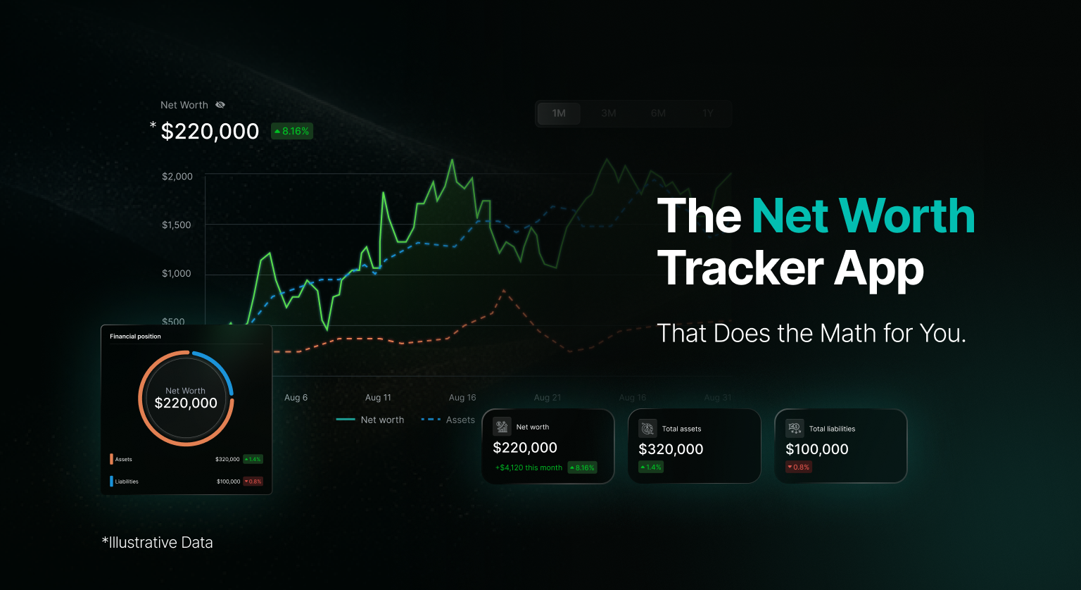
The single number that results from adding up all your assets and subtracting all your liabilities. Bank balances, investments, crypto holdings, property equity, pension value minus all debt: mortgage, credit cards, loans.
Why it matters: It is the only number that tells you your actual financial position. Everything else is a component of it.
Net Worth Trend (Last 6–12 Months)
Not just your current net worth, but a simple line or series of monthly snapshots showing how it has moved over the past six to twelve months.
Why it matters: Direction matters more than the current figure. A growing net worth at a modest level is a better sign than a high net worth that is declining steadily.
Monthly Cash Flow (Income vs. Spending)
What came in this month versus what went out. The difference is your monthly surplus or deficit.
Why it matters: This is the engine of your financial position. A consistent surplus builds net worth over time. A consistent deficit erodes it. Seeing this number clearly every month is more useful than any other single metric.
Spending by Category (Current Month vs. Personal Average)
Your spending broken down by category, shown alongside your personal average for the same category over the past three to six months.
Why it matters: The comparison is what makes the category total useful. Knowing you spent $340 on dining means little on its own. Knowing it is 40% above your average tells you something worth acting on.
Total Liabilities
Everything you owe, consolidated: mortgage balance, credit card balances, personal loans, car finance, student loans. One number, not five separate ones.
Why it matters: Debt is easy to lose track of when it lives across multiple institutions. Seeing the consolidated figure in one place creates the visibility needed to track progress against it.
Recurring Charges (Monthly Total)
The sum of all subscriptions and recurring charges across all connected accounts, with a list of individual items.
Why it matters: Subscription costs grow silently. Price increases, forgotten trials, and services used rarely but never cancelled are extremely common. This metric turns an invisible drain into a visible one.
Emergency Fund Coverage (Months)
Your liquid savings divided by your average monthly spending. Expressed as a number of months, not a dollar amount.
Why it matters: A dollar amount in a savings account is hard to evaluate without context. Three months of expenses in savings is a number that tells you exactly where you stand relative to a meaningful benchmark.
What to Leave Off Your Dashboard (Deliberately)
A finance dashboard is as much about what you exclude as what you include. These are the metrics that seem important but create noise rather than signal for most users.
Daily portfolio value changes
Watching your investment portfolio value change day to day does not produce useful insight for most people managing their own long-term finances. Markets fluctuate. Short-term changes in portfolio value carry no reliable information about long-term outcomes and create anxiety without enabling action. Monthly snapshots are sufficient for tracking investment growth over time.
Granular transaction lists on the main view
Individual transactions belong in a detail view you navigate to when something needs investigation, not on the main dashboard. A dashboard cluttered with transaction history creates visual noise that makes the high-level metrics harder to read.
Metrics you cannot act on
If a number changes and there is nothing you can meaningfully do about it based on that information, it does not belong on the main view. Knowing the exact current value of your home to four decimal places, updated daily based on an automated estimate, is not useful. Knowing your approximate equity position updated monthly is.
Comparison to external benchmarks
Knowing that your savings rate is above or below the national average tells you something about averages, not about your situation. Your financial position is relative to your own goals, income, and obligations — not to an external benchmark that has nothing to do with your life. Metrics that create benchmarking anxiety without informing specific decisions are better left out.
How to Build It: A Step-by-Step Approach
Here is the practical sequence for building a personal finance dashboard that stays useful over time, regardless of which tool or approach you use.
Step 1 List your financial accounts completely
Before building anything, write down every account that is relevant to your financial picture: every bank account, every investment account, every pension, every crypto exchange and wallet, every loan, every credit card. This list is the foundation of the dashboard. Anything not on it will not appear in the picture. An incomplete list produces an incomplete dashboard that misleads by showing a partial view as if it were complete.
Step 2 Decide which five questions you most need answered
From the list of possible questions — about spending, about net worth, about debt, about savings progress — choose the five that are most relevant to where you are financially right now. These five questions determine which metrics belong on your main dashboard view. Everything else is a detail view you navigate to when you need it.
Step 3 Choose your approach: manual, automated, or AI-powered
A manual approach (spreadsheet) gives you full control but requires consistent effort to stay current. An automated aggregation tool pulls account data automatically but may require manual categorisation work. An AI-powered platform automates both the data gathering and the interpretation layer, surfacing observations and answering questions without you having to dig. The right approach depends on how many accounts you have, whether you hold crypto, and how much time you want to spend on maintenance.
Step 4 Set up your account connections
For bank and investment accounts, use secure read-only connections through a reputable service. For crypto exchanges, generate read-only API keys with view-only permissions only. For wallet holdings, connect via public wallet address. For property values and pension accounts that cannot be connected digitally, set up manual entries with a note of when the figure was last updated. Connect everything on your list from Step 1, or mark what cannot be connected and how you will handle it.
Step 5 Build or configure the main view around your five questions
Arrange your dashboard so the metrics that answer your five questions are visible immediately, without scrolling or navigating. For a spreadsheet, this means the top section of your main tab. For an AI-powered tool, this means configuring what appears on the home screen. If the tool does not let you customise the main view, check whether a different tool does, or whether the default layout happens to match your five questions.
Step 6 Set a comparison baseline
Every change metric is only useful with a reference point. Set your personal averages for each spending category based on the last three to six months of data. For net worth, note your starting figure so the trend is visible from the first month. For debt, note the total you are starting with so you can track reduction over time. Without a baseline, every number is a snapshot. With one, every number is part of a story.
Step 7 Define a review cadence and stick to it
A personal finance dashboard is only useful if you look at it regularly. Weekly is appropriate for spending and cash flow. Monthly is appropriate for net worth trend and debt progress. Quarterly is appropriate for reviewing whether the dashboard itself still reflects your actual questions, and for updating any manual entries. Put the review on your calendar as a recurring event, not a resolution.
Step 8 Prune ruthlessly after the first month
After one month of use, look at every metric on your main view and ask: did I look at this? Did it tell me something useful? Did it change how I think or act? Anything that gets a no to all three should be moved to a detail view or removed entirely. A dashboard that shrinks toward what is genuinely useful is moving in the right direction. One that grows toward comprehensiveness is moving toward the problem you started with.
How AI Changes What a Personal Finance Dashboard Can Do
A traditional dashboard, whether built in a spreadsheet or a standard finance app, is static in one important sense: it shows you what you asked it to show. You configure the metrics, it displays them, and the interpretation remains your responsibility.
An AI-powered dashboard changes this in three specific ways worth understanding.
It surfaces observations you did not think to look for
A well-built AI finance platform does not just display metrics — it monitors your data for patterns and changes and surfaces observations you would not have thought to check. A subscription that quietly increased in price. A spending category that has been trending upward for three months without crossing any threshold you set. A month where your cash flow pattern looks different from your established baseline in a way that warrants a closer look. These are not metrics you configured. They are things the AI found by looking at your data continuously.
It answers questions in plain language rather than requiring you to navigate
Instead of building a formula to calculate your average dining spend over six months, you ask: “What is my average monthly dining spend for the past six months?” Instead of navigating to the right view to check your debt total, you ask: “How much do I owe across all accounts right now?” The dashboard becomes conversational. The metric you need is always one question away, rather than three navigation steps.
It provides context automatically
When your spending changes, an AI layer can tell you not just that it changed but which categories drove the change, how that compares to your baseline, and whether the pattern is consistent with previous months or something new. That context is what turns a number into useful information. Without it, you have data. With it, you have something you can act on.
The difference between a static dashboard and an AI-powered one is not the metrics it displays. It is whether the tool is working to understand your data or simply reporting it.
Tailoring the Dashboard to Your Situation
The core metrics described earlier work for most situations. But the emphasis and configuration of a personal finance dashboard should reflect where you actually are financially. Here is how the priority order shifts for different situations.
| Situation | Primary dashboard focus | Secondary metrics |
| Paying off significant debt | Total liabilities (trending down), monthly debt payments as % of income, remaining balance per debt account | Cash flow (surplus available to accelerate payoff), spending by category (finding further reduction) |
| Building an emergency fund | Emergency fund coverage in months (trending toward target), monthly cash surplus | Spending by category, subscription total (identifying savings to redirect) |
| Tracking investments and crypto | Net worth trend (monthly), asset allocation across account types, cost basis vs. current value | Cash flow, spending by category |
| Managing household finances as a couple | Shared cash flow (combined income vs. combined spending), shared net worth, shared debt total | Category-level spending with per-person visibility, savings progress toward shared goals |
| Early in financial life (first job, student debt) | Cash flow (is spending below income?), monthly surplus, emergency fund coverage | Debt balance and trend, subscription total |
| Approaching retirement | Net worth trend, retirement account balances and growth, projected coverage of estimated expenses | Cash flow, spending by category to model retirement spending needs |
Common Mistakes When Building a Finance Dashboard
Starting with the tool instead of the questions
Most people open a finance app or a blank spreadsheet and start adding metrics. The result is a dashboard shaped by what the tool makes easy to show, not by what you actually need to know. Start with your questions. Let the questions determine the metrics. Let the metrics determine the tool.
Treating the first version as the final version
A personal finance dashboard that is not revised after the first month of use is almost certainly not the right dashboard. The first version is a hypothesis about what metrics matter to you. After a month of actual use, you have evidence about which ones you actually looked at and which ones just took up space. Use that evidence.
Connecting accounts but not verifying the data
Connecting a bank account to a finance tool does not guarantee the data is accurate. Transactions get miscategorised. Connections occasionally sync incorrectly. A balance figure that seems surprising is sometimes reflecting a real change and sometimes a sync error. In the first few weeks of using any tool, verify the figures you rely on against the source institution to establish confidence in the data quality.
Optimising for visual complexity
A finance dashboard with multiple chart types, colour gradients, and animated transitions looks impressive and is almost always harder to use than a simple, clearly labelled layout. Clarity is the goal. If you cannot read the key figures at a glance, the design is working against you regardless of how sophisticated it looks.
Setting up the dashboard and never reviewing whether it still fits
Your financial questions change as your situation changes. The dashboard that was right when you were focused on paying off debt is not the right dashboard when debt is cleared and you are shifting focus to building investments. Set a quarterly reminder to ask: do these metrics still reflect what I most need to know?
The Honest Summary
A personal finance dashboard that actually makes sense is not the one with the most metrics. It is the one built around the specific questions you actually need to answer about your financial life, configured to surface those answers clearly and without friction, and reviewed regularly enough that you trust the data and use the tool consistently.
The seven core metrics — net worth, net worth trend, monthly cash flow, spending by category with personal baseline, total liabilities, recurring charges, and emergency fund coverage — cover the essential questions for most people in most financial situations. Everything beyond those should earn its place on the main view by being something you genuinely look at and find useful.
Building the dashboard is the easy part. The harder part is the discipline to keep it simple, to prune it when it grows cluttered, and to update it as your questions change. A dashboard you check every week because it tells you something useful is worth more than a comprehensive financial view you open once a month and feel overwhelmed by.
Frequently Asked Questions
What should a personal finance dashboard include?
The core metrics for most people are: total net worth, net worth trend over the past six to twelve months, monthly cash flow (income minus spending), spending by category compared to your personal average, total liabilities across all debt accounts, recurring charge total, and emergency fund coverage expressed in months of expenses. Beyond these, include only what answers questions you actually have and check regularly.
What is the best tool for building a personal finance dashboard?
The right tool depends on your financial complexity and how much time you want to spend on maintenance. A spreadsheet gives you full control and privacy but requires consistent manual effort. A standard finance app automates data gathering but may have a fixed layout. An AI-powered finance platform automates data gathering and adds an interpretation layer that surfaces observations and answers questions in plain language. The best tool is the one that matches your accounts, your questions, and the effort you are willing to sustain.
How many metrics should a personal finance dashboard have?
As few as possible to answer your five most important financial questions. Most people find that between five and eight metrics on the main view is the practical limit for a dashboard that gets used consistently. More than that and the important numbers get lost in the noise. Remaining metrics belong in detail views you navigate to when you need them, not on the main screen.
How do I include cryptocurrency in my personal finance dashboard?
For crypto to appear accurately in a personal finance dashboard, you need live pricing data connected to your actual holdings, not a manually entered figure that goes stale. Connect your exchange accounts via read-only API keys and connect wallet addresses via public address monitoring. Ensure the tool you are using handles cost basis calculation, since the difference between your cost basis and the current value is more useful than the current price alone.
How often should I review my personal finance dashboard?
Spending and cash flow metrics are worth checking weekly or twice monthly. Net worth and debt trend are meaningful to review monthly. The dashboard configuration itself — whether the metrics still reflect your actual questions — is worth reviewing quarterly. Annual reviews are appropriate for larger structural questions like whether the tool you are using still fits your financial complexity.
How is an AI finance dashboard different from a regular one?
A standard finance dashboard displays the metrics you configured and waits for you to interpret them. An AI-powered dashboard actively monitors your data, surfaces observations you did not ask for, answers direct questions in plain language based on your actual account data, and provides context for changes rather than just reporting the numbers. The difference is between a dashboard that reports and one that analyses.
Disclaimer
This article is for general informational and educational purposes only. It does not constitute financial advice, investment advice, or any form of personalised guidance. Dashboard structures, metric recommendations, and tool categories described reflect general best practices as of July 2026 and may not be appropriate for every individual’s financial situation.
AI financial assistants and personal finance dashboards are organisational and analytical tools. They do not manage assets, execute transactions, or provide personalised financial recommendations. The metrics and structures described in this article are intended as a general educational framework, not as tailored financial guidance.
For advice tailored to your personal financial situation, goals, or circumstances, consult a licensed financial advisor or qualified professional in your jurisdiction.