
Almost everyone who tries to build a personal finance dashboard makes the same mistake: they start with the spreadsheet, not the question. They open a blank sheet, add a column for every account they own, and three weeks later the thing sits untouched because updating it feels like a chore with no clear payoff.
A dashboard that actually gets used works backwards from that. It starts with the two or three questions you genuinely want answered — what am I worth right now, where is my money actually going, am I on track for the things I care about — and builds only what answers those questions. Everything else is noise that makes the dashboard harder to maintain and easier to abandon.
This piece walks through how to decide what belongs in a personal finance dashboard, how to choose between a spreadsheet and a dedicated app, what to automate versus enter manually, and how to keep the thing alive past the first month.
Start With the Questions, Not the Columns
Before opening any tool, write down the three to five questions you actually want your money to answer. Not “track my finances” — that is a category, not a question. Something closer to: what is my net worth today, how much did I spend on discretionary categories last month, and am I saving enough to hit a specific goal by a specific date.
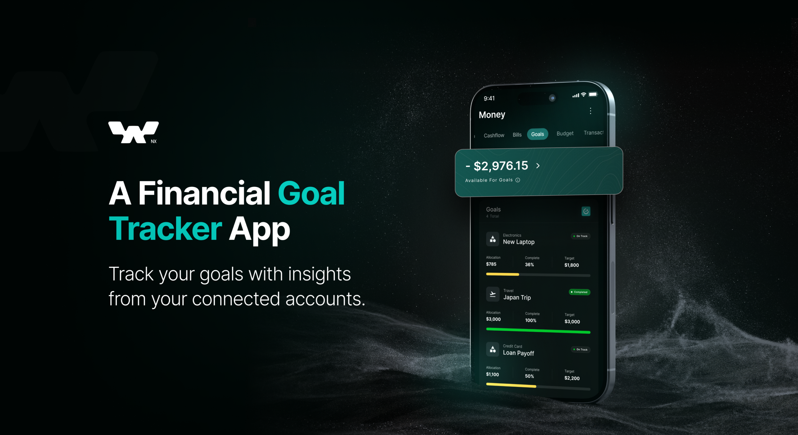
This matters because it determines everything downstream. Someone who mainly wants to know their net worth needs account balances updated regularly and not much else. Someone trying to fix a spending problem needs transaction-level categorisation, which is a heavier lift. Someone saving toward a house down payment needs a goal-tracking view with a timeline, which neither of the first two setups naturally provides.
Building all three because they all sound useful is exactly how a dashboard becomes too much work to maintain. Pick the one or two questions that actually change a decision you make, and build around those first.
The Three Layers Every Working Dashboard Needs
A single source of truth for balances
Every account you hold — checking, savings, brokerage, retirement, crypto, a loan — needs to land in one place, updated on a schedule you can actually stick to. This is the layer people get wrong most often by either connecting too little (missing accounts mean the net worth number is quietly wrong) or trying to automate too much too early, before they have confirmed the manual version is worth maintaining.
Manual entry on a fixed weekly or monthly schedule beats a half-connected automated feed that silently goes stale. Automate later, once you know which accounts you actually check.
Categorised spending, at whatever resolution you will actually maintain
This is the layer with the highest drop-off rate. Ten or twelve broad categories, reviewed monthly, is something most people keep up. Forty granular categories with weekly review is something most people keep up for about a month. Match the resolution to the habit you can sustain, not the level of detail that looks impressive in a template.
A small number of trend views, not a wall of charts
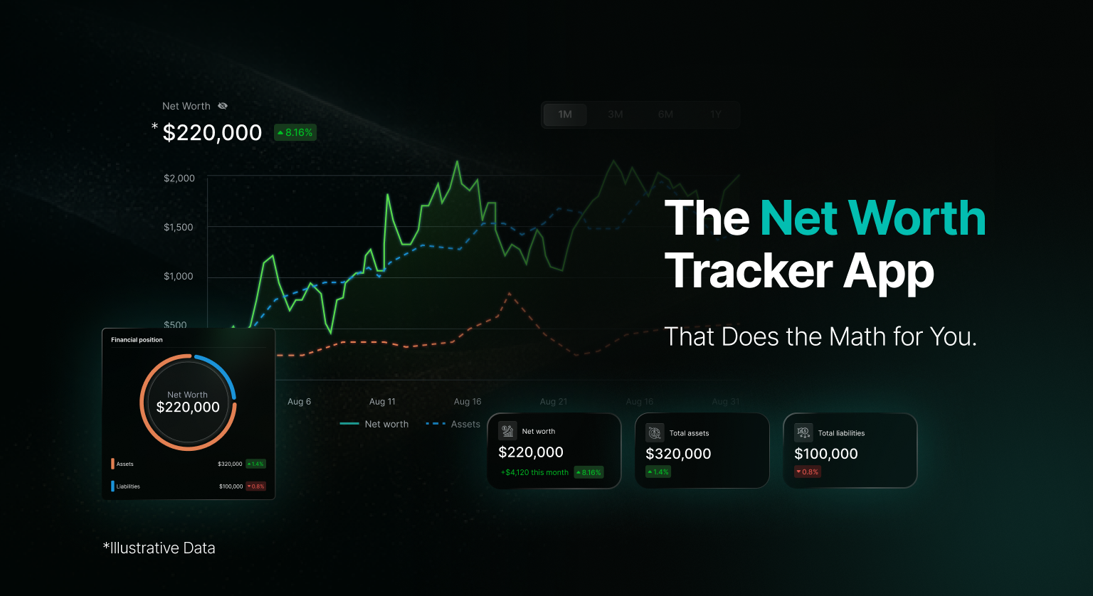
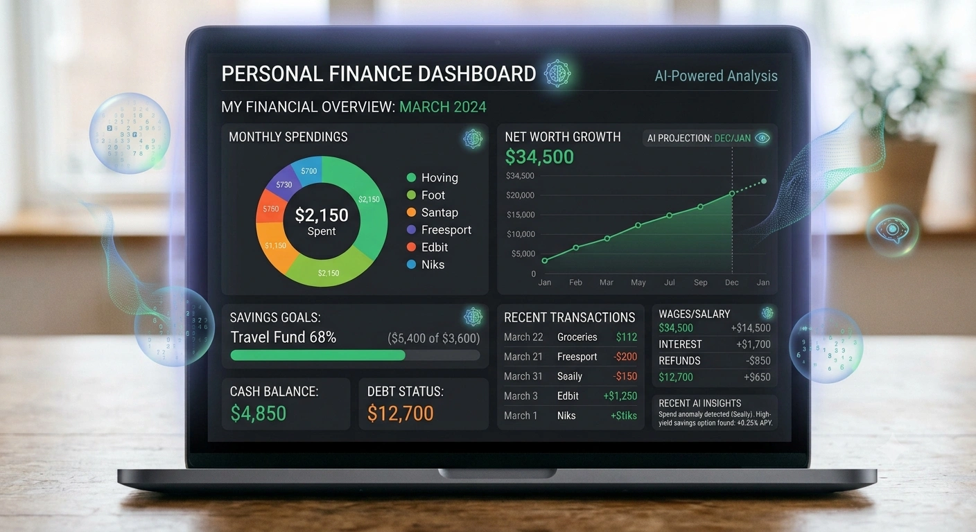
Net worth over time. Spending by category over the last three to six months. Progress toward one or two active goals. That is usually enough. A dashboard with fifteen charts is not more informative than one with three — it is just harder to open without feeling overwhelmed, which is the actual reason people stop opening it.
Spreadsheet, No-Code Tool, or Dedicated App?
This is less about which is “best” and more about matching the tool to how much manual upkeep you are realistically willing to do.
A spreadsheet
Best when your accounts are few, you are comfortable with formulas, and you want full control over exactly what gets tracked and how. The tradeoff is that every balance update and every categorisation decision is manual unless you build or borrow a script to pull data in, and spreadsheets get fragile fast once formulas span many tabs.
A no-code dashboard tool
Tools built for connecting data sources to visual dashboards sit in between — less flexible than a spreadsheet, less automated than a dedicated finance app, but often a reasonable middle ground if you already use one for other things and do not want another subscription.
A dedicated personal finance app
Best when you have several accounts across different institutions and asset types, and manual entry is the actual reason a spreadsheet-based attempt failed before. The tradeoff is less customisation over exactly what is shown and how, and a dependency on the app’s account connections staying reliable.
None of these is universally correct. The right test is honest: did your last attempt at tracking this fail because the tool could not do what you needed, or because you stopped updating it? Those point to different fixes.
What to Automate First
If you are going to automate anything, automate the parts that are tedious and low-judgment before the parts that are complex and high-judgment.
• Balance pulls from checking, savings, and brokerage accounts — this is largely mechanical and the most time saved for the least risk of error.
• Recurring transaction categorisation — subscriptions, rent, a regular paycheck — since the pattern rarely changes.
• Simple trend charts built from data you are already collecting, rather than a new manual chart each month.
Leave for manual review: irregular or judgment-heavy transactions, anything involving crypto cost basis or DeFi positions, and any account type your tool connects to unreliably. Automating something unreliable does not save time — it just moves the correction work later and makes it harder to spot.
Read More: How to build a personal finance dashboard that actually makes sense
The Mistake That Kills Most Dashboards: Too Much Precision, Too Soon
The most common failure pattern is not a bad tool choice — it is building for a version of yourself with more discipline than the one who actually has to maintain the thing weekly. A dashboard with daily transaction-level categorisation, five goal trackers, and a dozen charts looks thorough on day one and gets opened twice.
Start smaller than feels necessary: one net worth number, one spending trend, one goal. Add a layer only after the current version has survived a full month of actual use. A dashboard you check every week with three numbers beats one with thirty numbers that you check once.
Keeping It Alive Past the First Month
The first few days feel productive simply because you have consolidated something that was scattered. That initial motivation fades by week two, which is exactly when most home-built dashboards quietly stop being updated.
Attach the update to something you already do — a Sunday evening routine, the first weekday of the month, right after payday — rather than relying on remembering. A recurring calendar reminder does more for a dashboard’s survival than any feature you could add to it.
After a month, the honest test is whether you are opening it to answer a real question, or opening it out of guilt and closing it without doing anything differently. The first means it is working. The second means it needs to be smaller, not bigger.
The Honest Summary
A personal finance dashboard that actually makes sense is not defined by how many accounts it connects or how many charts it shows. It is defined by whether it answers the two or three questions you actually care about, on a schedule you can realistically keep up, without becoming a maintenance burden you resent.
Start with the questions. Pick the tool that matches how much manual work you will genuinely do, not the one with the most features. Automate the tedious parts first and leave judgment calls for manual review. And build something smaller than feels impressive on day one, because the version you actually keep using next year matters more than the version that looked complete in week one.
Frequently Asked Questions
Should I use a spreadsheet or an app for a personal finance dashboard?
It depends on whether your past attempts failed due to a tool’s limitations or your own consistency. Spreadsheets suit people with few accounts who want full control and are comfortable with formulas. Dedicated apps suit people with many accounts across institutions where manual entry was the actual reason a previous attempt stalled.
How many categories should I track for spending?
Fewer than feels thorough. Ten to twelve broad categories reviewed monthly is sustainable for most people. Highly granular category systems tend to get abandoned within a month because the upkeep outweighs the insight gained.
What should I automate first in a finance dashboard?
Balance pulls and recurring transactions, since they are mechanical and low-risk to get wrong. Leave irregular transactions, crypto cost basis, and unreliable account connections for manual review rather than automating something that needs regular correction anyway.
Why do most DIY finance dashboards get abandoned?
Usually because they were built with more detail and more charts than the person maintaining them had the discipline to update. A dashboard that takes real effort to keep current will stop being updated within a few weeks, regardless of how good the initial design looked.
How do I know if my dashboard is actually working?
The clearest signal is whether you open it to answer a real question about your money, versus opening it out of habit or guilt and closing it without acting on anything. The first means it is doing its job. The second is a sign to simplify it.
Disclaimer
This article is for general informational and educational purposes only. It does not constitute financial advice, investment advice, tax advice, or any form of personalised financial guidance. Nothing in this article should be interpreted as a recommendation to use any specific product, tool, or platform.
Any tools, spreadsheet approaches, or apps mentioned are described generally and their suitability depends on individual circumstances. For advice tailored to your personal financial situation, consult a licensed financial advisor or qualified professional in your jurisdiction.